Photoshop Web Template – Website Design Tutorial
A recommended tip is that you learn the
Shortcut keys!Why? To save some time of course!
And remember to press CTRL+S (save) very often!
Ok! Let’s start.
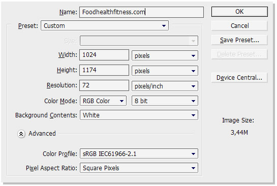
First you need a new document CTRL+N, with the Width: 1024 pixels and the Height: 1174 pixels.
Now change the background-color to “#817b74″


(
G)

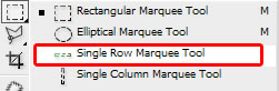
Select the “Rectangular Marquee Tool”.

Shortcut key: (
M).
And hold it and drag it to make a rectangular shape, put the shape where you want to put the white. Then you copy (ctrl+c) and paste (ctrl+v) to get a new layer!
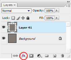
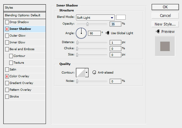
Why is not my layer white like yours? Well you need to go “FX” aka layer style. If you don’t see this image press “F7″ on your keyboard!
Now, select Stroke, Color overlay, Outer glow and Inner shadow and do the following!

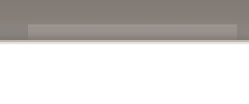
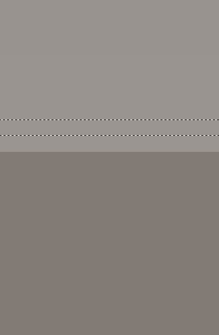
Select the rectagular marquee tool and drag it like this, remember to have the background layer selected!
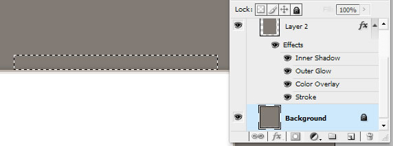
Now copy and paste, so you get the mark into a new layer, then go to FX, layer style once again!
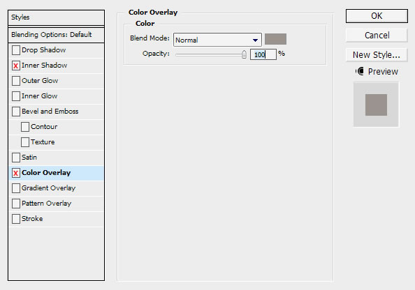
Then press “Color Overlay” (#9b948e)
And then Inner shadow
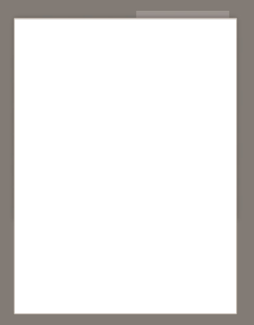
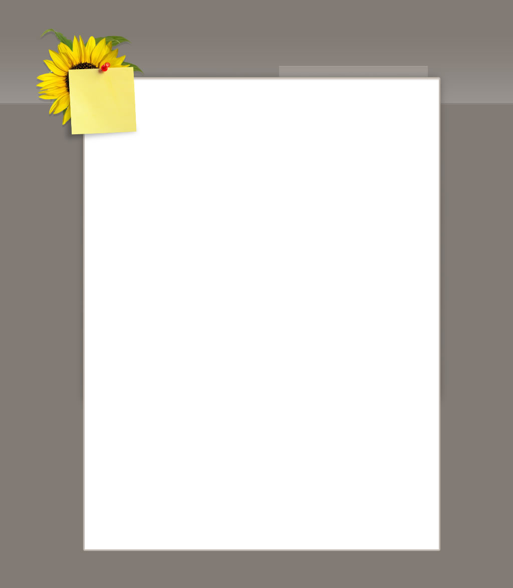
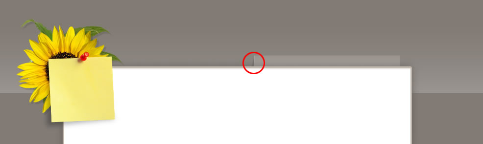
This is what it should looks now

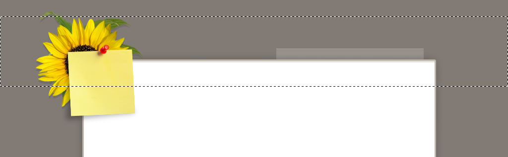
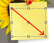
Your probably wondering how I got the flower and the note look so real? Well we call them Stock images!
Whats the best way to cut out the object out of the image? Well to get the best quality on the cut I strongly recommend the pen tool.
Just to make sure, this is what you should have right now.
Select your stock image(s)

This tool is called “Pen tool”


when you have add the point marks around the objects select this tool.
and drag the points to a smooth and clean point.
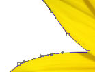
Then right click on the object and hit “Make selection”
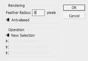
And hit OK. Now you should have a selection around the object.

Another way to cut out and object from a white background is to select this tool

and select the white background and make an inverse (Shift+Ctrl+I)
And then copy and paste. BUT! this way makes the object loose its quality, so i strongly recommend the pen tool!
Now when you selected you stock image and made a cut-out of the object put it behind the white content layer. Just like i did.
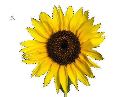
Another stock image attached with a brushed shadow, over the white content layer.

You can add some sharpness

to the image since it where minimized and loosed a bit of quality!
Select the Background layer
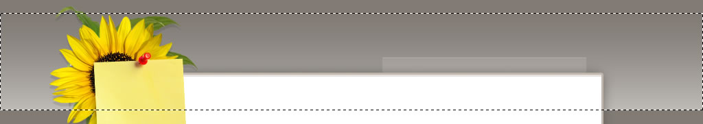
Select the rectangular marquee tool and mark it like this
Select this tool

(
G)

Then create a new blank layer

Now drag it from the bottom of the mark to the top to make it like this
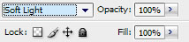
Add the layer to “soft light”
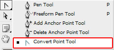
Select this tool by right click on the markquee icon.
Zoom in (Z) and put it one pixel over the base line.
Now press this icon

and a the top of that meny, press on the “Soild color” and select (#75706c)


Once again, this is what you should have something like this right now
Then you can add these small things that no one care about, just filling out the layout.
Like this, adding a shadow using the pen tool
Then right click and hit “Make selection” once again. Then press on this icon on the layer panel
and hit “Brightness /Contrast”
I used the same technique to make the shadow at the bottom.
“Why did you add these shadows, it dosen’t fit to anything?” Well i call them fill-outs. Details matters, so i added small things that no one would notice but they know its there.
Then when it comes to adding the text.
This layout is basically based on text so i wanted to show you how it works.
Press this button on the panel,

and drag it like this
You can modify the text by going the the Character panel
Then press “Character”! I used Times new roman and Tahoma in this layout!
Then you can rotate the text area to fit the note more perfect.

Foodhealthfitness.com logo

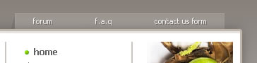
The menu is 12pt tahoma font
The sub navigation 11pt tahoma
Other stock-images

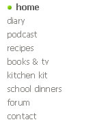
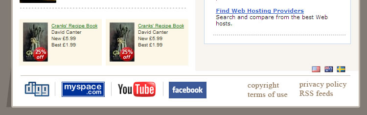
Then add your favorite links at the bottom

Now the last thing you need to add when you got you content text and images on place.
Add a new group layer and select all the layers you have and drag them into this group!
When you have done that, right click on the group you just created and hit “Dublicate group…”
And when its dublicated, klick on the group and press “CTRL+E” and Press M and cut out something like this.
Then drag the point up while houlding Shift+alt
Then make it like this.
Now. Hit this

“mask” on the layer panel and then

Make sure its black and transperant.

“Drag it up!”
Our Result with our content!


